Accessibility, SEO and Web Design Are the Same Job
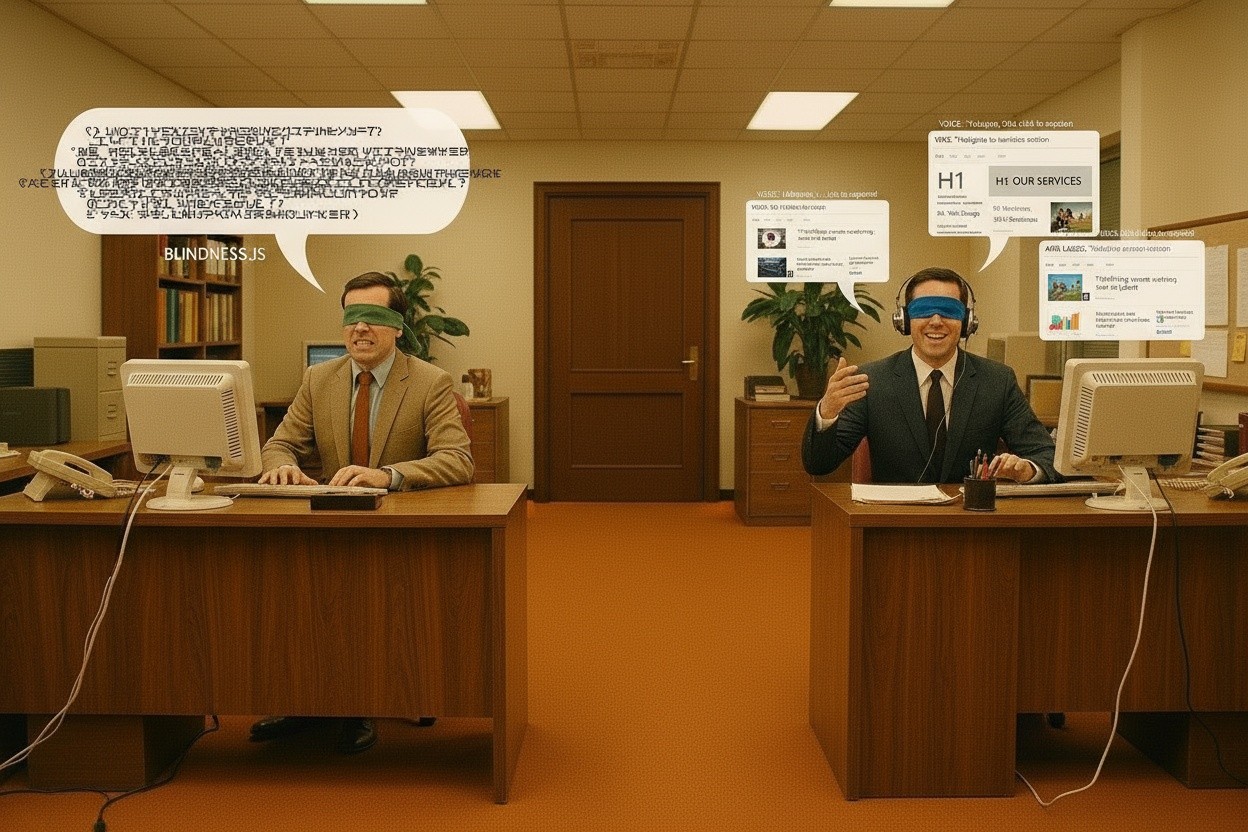
At the turn of the century, most teams cared about one thing: getting pages indexed. Some of the WYSIWYG editors built pages that loaded fast for humans but stayed unreadable for screen readers and bots. Twenty five years later, many teams still treat accessibility as an extra task, something that sits behind design, content, SEO / LLM audits and launch deadlines. As large language models begin reading and summarizing websites, they need the same clear structure that screen readers have always needed.
Accessibility, SEO and web design were never meant to operate as separate priorities. Together, they shape how people discover content, how they understand it, and how they act on it. They also shape how search engines and LLMs read that same content. Align the three and you build experiences that serve human visitors and automated readers at the same time.
This article traces those connections and shows how to build accessibility into every stage of a project.
Search Engines Behave Like Blind Users
Search engines act like blind visitors with a perfect memory. They ignore gradients, animations and clever scroll effects. Instead, they read code the way a screen reader does: parsing semantic HTML, following heading hierarchies, and interpreting alt text and labels.
Structure content for accessibility and you hand search engines a clear map of the page in the process.
Google's algorithms historically paid little attention to heading structure, and that lack of attention rarely affected rankings. Most other search engines, along with every screen reader and LLM, read headings closely. Use heading tags the way they were designed to work: H1, H2 and H3 should describe a logical outline of the page. Screen reader users jump between headings to navigate content, and search engines rely on that same structure to understand the topic at hand.
Write descriptive alt text for every image. Blind users need it to understand what appears on screen, and search engines use the same text to gain context about the image.
Reserve ARIA (Accessible Rich Internet Applications) attributes for situations where native HTML cannot convey meaning on its own. These attributes help assistive technologies interpret interactive components, and they give search engines clearer signals about how those components function.
Here's a quick way to test a page: load it without JavaScript, then navigate using only the keyboard. That experience mirrors what a search bot encounters, and what many users with disabilities face every single day.
The Performance Connection
Accessible sites tend to feel faster and simpler, because designing for assistive technology, cognitive differences or limited mobility removes friction at every turn.
Teams that prioritize accessibility usually cut:
- Heavy, purely decorative animations
- Overly complex menu systems that bury basic navigation
- JavaScript frameworks deployed for interactions that plain HTML already handles
Cleaner pages load faster, and Google measures those gains through Core Web Vitals and mobile performance metrics. A bloated design that leans on effects, oversized videos and complicated scripts damages accessibility first. It hurts rankings to a lesser degree, and it often drags conversions down as well.
Clients frequently request hero videos, parallax sections and tiny navigation icons. These elements look impressive in a pitch deck. But they can exclude visitors who cannot see subtle effects, cannot tap small targets accurately, or cannot afford to wait for a large media file on a slow connection.
Semantic HTML Is the Foundation
Semantic HTML holds everything else together. Modern web design often centers on frameworks, components and visual polish, yet underneath all of that, semantic HTML still determines how accessible and understandable a site becomes.
Consider these examples:
- A button should use the <button> element, not a generic <div> wrapped in a click handler
- Primary navigation belongs inside <nav>
- Main content sits inside <main>
- Distinct pieces of content use <article> or <section>, depending on context
Relying on semantic elements pays off in several ways. Screen readers recognize and announce regions and controls correctly. Keyboard users move through the page in a predictable order. Search engines identify which parts of the page carry the most weight. Browsers apply sensible default behavior and baseline styling automatically. Future maintenance gets easier too, since the structure documents itself.
Ask a simple question during development: are you building meaningful HTML, or reaching for a generic container every time a layout problem appears? The answer usually predicts how accessible, and how search friendly, a site will turn out to be.
Colour Contrast and Visual Hierarchy
Colour contrast was never only about compliance. Thoughtful contrast and a clear visual hierarchy guide every visitor through content, whether or not they have a diagnosed vision impairment.
Strong, accessible contrast paired with a clear visual order produces several benefits. People with low vision read comfortably. Every visitor scans quickly and finds relevant information faster. Calls to action stand out from the surrounding page. Visitors spend more time engaging with content instead of straining to decode it.
These decisions influence measurable behavioral metrics, including bounce rate, time on page and conversion rate. A site that reads easily and navigates cleanly keeps people around longer, and sites that consistently deliver a better user experience tend to perform better in search over time.
Treat contrast as a foundational part of the visual system from the very first mood board or style tile. Fixing it later, as a compliance patch, costs more time and produces weaker results.
Mobile Responsiveness as Accessibility
Mobile first design isn't listed as a standalone ranking factor, yet mobile first indexing means the quality of a mobile site now determines search rankings directly.
Many people with motor impairments prefer touch devices. Simpler layouts help visitors with cognitive challenges focus on the parts of a page that matter most for their task. In large parts of the world, mobile access is the only access available.
Good responsive design tends to do several things well. It uses large, comfortable touch targets. It simplifies navigation to fit limited screen space. It prioritizes the content that matters most to the task at hand. It reduces page weight so mobile users avoid long load times.
More than 60% of global internet traffic now comes from mobile devices, and search engines judge a site primarily by its mobile experience. The improvements that help someone on a small screen with a weak wifi signal also help someone using assistive technology, or running an older phone or laptop.
Responsive, accessible design gives a wide range of people a workable path to the same information, even though each person experiences that path differently.
Forms Are Where Many Experiences Break
Forms often reveal the true quality of a site. They may look polished on the surface, yet in practice they frequently become obstacles, particularly for keyboard users and screen reader users.
Accessible forms share a consistent set of traits. Every input carries a visible label, correctly linked to its field. Placeholder text never substitutes for a label. Error messages appear near the field that caused them and explain how to fix the problem. Tab order follows the logical reading order of the page. Related inputs group together using <fieldset> and <legend>. Required fields signal that status through text and symbols, not colour alone. Validation returns feedback that is clear and specific.
These same practices raise completion rates for every user, not only for those relying on assistive technology. When visitors understand what a field requires, recover easily from errors, and move through a form quickly, they convert more often. That translates directly into more leads, more signups and more revenue.
Changing the Way Teams Build
The hardest shift has nothing to do with new tools. It has everything to do with getting designers, developers and SEO specialists to think together from the first meeting.
Many projects still follow a fragmented path. Designers deliver static mockups without heading structures. Developers translate those mockups into components without considering semantics. SEO specialists arrive after launch and uncover structural problems that now cost extra time and budget to fix.
A more integrated approach looks different at each stage of a project.
During Planning
- Define the content hierarchy and headings before locking in pixel perfect layouts
- List every interaction point and user journey
- Map keyboard navigation flows early
- Identify non text content and plan alt text, captions and transcripts in advance
During Design
- Test colour contrast while choosing palettes and styles, not after
- Design visible focus states for keyboard users
- Build genuine mobile experiences rather than squished desktop layouts
- Account for cognitive load so layouts stay clear instead of cluttered
During Development
- Reach for semantic HTML elements first
- Add ARIA attributes only where native elements fall short
- Test interactions regularly using nothing but the keyboard
- Check against WCAG (Web Content Accessibility Guidelines) as a continuous practice, not a single audit
During Testing
- Use real screen readers rather than relying only on automated tools
- Navigate the entire site without touching a mouse
- Zoom the interface and increase text size to simulate low vision scenarios
- Measure performance on slow networks and older devices
Dial up era constraints forced teams to care about page weight and performance, because slow pages lost visitors within seconds. Modern broadband masks some of that pain, yet plenty of users still live with weak signals. Building with some empathy for them improves outcomes for everyone else too.
AI and the Future of Accessible Design
AI tools now assist with large parts of the workflow. They generate draft alt text, check colour contrast, flag reading level issues and suggest structural improvements. Used carefully, these features accelerate both accessibility and SEO work.
Without the right prompts, though, AI generated content often arrives with weak hierarchy and little semantic meaning. Different platforms produce output that varies widely in quality, and much of it needs editing before it genuinely serves real users. Building a dedicated instruction set, essentially an LLM style guide for your own content, gives the AI a consistent framework to follow. That single step speeds up the entire process.
Images still need surrounding context in words so search engines can understand them properly. AI generated text still needs human judgement to confirm the structure works for assistive technology, supports search goals and matches brand voice.
Choosing How You Build
Every project forces a decision at some point. One path leads to accessible, well structured sites that rank, convert and support a wide range of users. The other path delivers a site that looks polished, struggles in search, frustrates visitors, and underperforms against business goals.
Accessibility, SEO and design were never competitors. Approach them as one strategy, and the result works for people first, with strong search performance following as a natural consequence.
More insights from the blog
Why Builders, Plumbers, and Contractors Are Losing Customers to AI
When someone types "best plumber near me" or" commercial roofing contractor" into Google today, they do not always get a simple list of blue links. More often, they get an AI-generated answer at the top, assembled from content that AI engines have already read, assessed, and summarised.


Still have questions? Get in touch for a free strategy session.